译者:Kevin 来源:http://blogs.msdn.com/excel
发表于:2006年7月7日
All that said, let’s return to Excel 12, and take a look at what the PivotTable Field List looks like when connected to an Analysis Services 2005 model.
我们说了那么多,让我们回到Excel 12,看看当连接到Analysis Services 2005模型时数据透视表的字段清单长什么样。
Measure groups
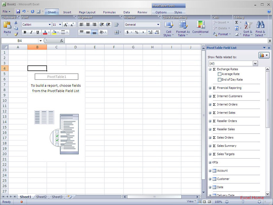
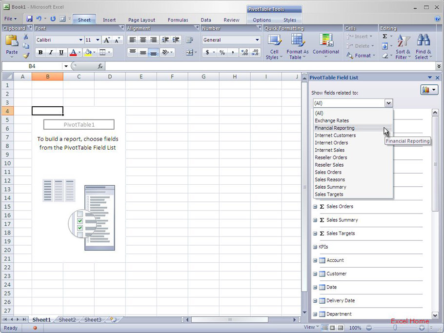
When connected to Analysis Services, a PivotTable exposes three types of fields – “measures”, or the numbers (like “sales” and “profit”) that appear on your PivotTables, as well as “KPIs” and “dimensions” (both discussed below). Measures can be grouped together in Analysis Services (by the person that designs the model) into something called “measure groups”. In the Excel 12 field list, each measure group has a “sigma” icon to communicate to the user that the fields in the group are numerical and that they belong in the Values area of the PivotTable. Measure groups essentially represent different sets of business metrics available for analysis; typically a measure group contains related measures from the same business application. In the image below, the Exchange Rates measure group folder is open and there are two measures listed which can be added to the PivotTable – Average Rate and End of Day Rate.
衡量组合
当连接到Analysis Services时,数据透视表会显示三类字段——“衡量”,或者数字(如“销售”和“利润”),还有“KPIs”和“维度”(下面都会讨论)。衡量可以在Analysis Services里组合(由设计该模型的人)为名叫“衡量组合”的东西。在Excel 12字段清单里,每个衡量都有一个“西格马”图标,告诉用户该组合里的字段是数字型的,并且它们都属于数据透视表中的数值区域。衡量组合本质上代表不同的分析可用的业务方法(译者:作者经常提到Business Metrics,不明所以,暂且译为业务方法);衡量组合通常包含来自相同业务软件的相关衡量。在下面的图像上,Exchange Rates衡量组合是开启的,有两个衡量,它们可以添加到数据透视表——Average Rate和End of Day Rate。
Key Performance Indicators (KPIs)
Below the measure group folders are is a KPI folder (assuming KPIs have been defined in an Analysis Services model). This folder contains Key Performance Indicators defined on the Analysis Services server. (Key Performance Indicators are a big subject unto themselves – for the sake of this article, suffice to say that they track key business metrics and that they are defined in Analysis Services). The different components of a KPI (Value, Goal, Status and Trend) can be added to the Values area of the PivotTable so you can track the latest values of your key business metrics. Here is a screenshot of the KPIs folder … in the image, the Product Gross Margins KPI is open and all you have to do to add the Value, Goal, Status or Trend of the KPI to the PivotTable is to check the checkbox next to it.
关键性能指标(KPIs)
在衡量组合文件夹下面是一个KPI文件夹(假设KPIs已经在Analysis Services模型里定义了)。该文件夹包含在Analysis Services服务器上定义的关键性能指标。(关键性能指标对它们自己来说是个大主题——为了这篇文章,足可以说它们追踪关键业务方法,它们在Analysis Services上已定义好)。KPI的不同成员(数值,目标,现状和趋势)可以添加到数据透视表的数值区域,这样你就可以在你的关键业务方法中追踪最新的数值。这是KPI文件夹的截屏……在该图片里,Product Gross Margins KPI是开启的,所有你需要做的只是勾选KPI里的Value,Goal,Status或者Trend旁边的勾选框,将它们添加到数据透视表里。
KPIs in PivotTables are quite interesting – I’ll cover PivotTable KPI support in more detail in an upcoming post.
数据透视表里的KPI是很有趣的——我将在即将发表的文章中更详细地叙述数据透视表的KPI支持。
Dimensions
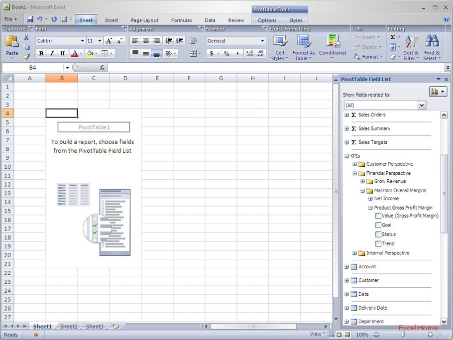
Finally, the dimensions of the Analysis Services model are listed in the PivotTable field list. (Dimensions are the different attributes that you can use to slice and dice your data, like time, geography, customer, product, etc.) In the screenshot below, the Customer dimension folder is open and you can see the customer-related fields available in the Analysis Services model.
维度
最后,Analysis Services模型的维度列在数据透视表的字段清单里。(维度是一些不同的属性,你可以用来将你的数据分成片断,例如时间,地区,消费者,产品,等等。)在下面的截屏中,Customer维度文件夹是开启的,你可以看到Analysis Services模型中与消费者相关的字段。
Organizing the field list
Within the measure group folders, the KPIs folder and the dimension folders, the person that authors the Analysis Services model can set up subfolders to organize the data in an intuitive way, making it much easier for business users to navigate the field list. In the screen shot above, an example would be the Contacts and Location folders. These folders are defined on the Analysis Services; Excel picks them up when initializing the PivotTable Field List.
组织字段清单
在衡量组合文件夹里,KPIs文件夹和维度文件夹,Analysis Services模型的作者可以创建子文件夹,以一种更直接的方式来组织数据,让业务用户更容易浏览字段清单。在上面的截屏中,Contacts和Location文件夹是这方面的例子。这些文件夹是在Analysis Services上定义好的;Excel在初始化数据透视表字段清单的时候选上它们的。
For those of you that are familiar with SQL Server 2005 Analysis Services, the field list will show both user hierarchies (like Customer Geography in the example) and attribute hierarchies (like Email Address in the example). If you do not specify any folder for an attribute hierarchy on the server, we will display it in a special “More Fields” folder under the dimension where it belongs. We do this since there are typically many attribute hierarchies (often one per column of each table in the source database), and listing them at the top level makes it hard to navigate the field list.
对于那些熟悉SQL Server 2005 Analysis Services的人来说,字段清单既会显示用户层次(象示例中的Customer Geography),也会显示属性层次(象示例中的Email Address)。如果你在服务器上不指定任何属性层次的话,那么我们就会在维度文件夹那里显示一个特殊的“More Fields”(译者:更多字段)文件夹。我们这样做是因为通常的属性层次太多了(在源数据库里,经常是每列一个),如果将它们列在上面,就会使字段清单的浏览太困难了。
Focusing the information in the field list
When a PivotTable is connected to SQL Server 2005 Analysis Services, at the top of the PivotTable Field List, there is a drop down where the user can select which measure group you want to work with. In many cases, you only need the measures from one measure group for a report, and this drop down allows you to filter out all the other measure groups as well as KPIs and dimensions that are not related to the measure group you select. This can have the effect of reducing the number of fields visible in the field list making it much easier to build your analysis.
聚集字段清单中的信息
当一个数据透视表被连接到SQL Server 2005 Analysis Services时,在数据透视表上面的字段列表里,有一个下拉列表,用户可以选择想要使用哪个衡量组合。很多情况下,你的报告中只需要一个衡量组合里的衡量,该下拉列表允许你筛选掉所有其它的衡量组合,以及和你所选衡量组合不相关的KPIs和维度。效果是可以减少字段清单上的可见字段数目,使你更容易去创建你的分析。
To illustrate this with an example, I’ll pick the Financial Reporting measure group.
为了示范,我将选择Financial Reporting衡量组合。
 点击看大图
点击看大图
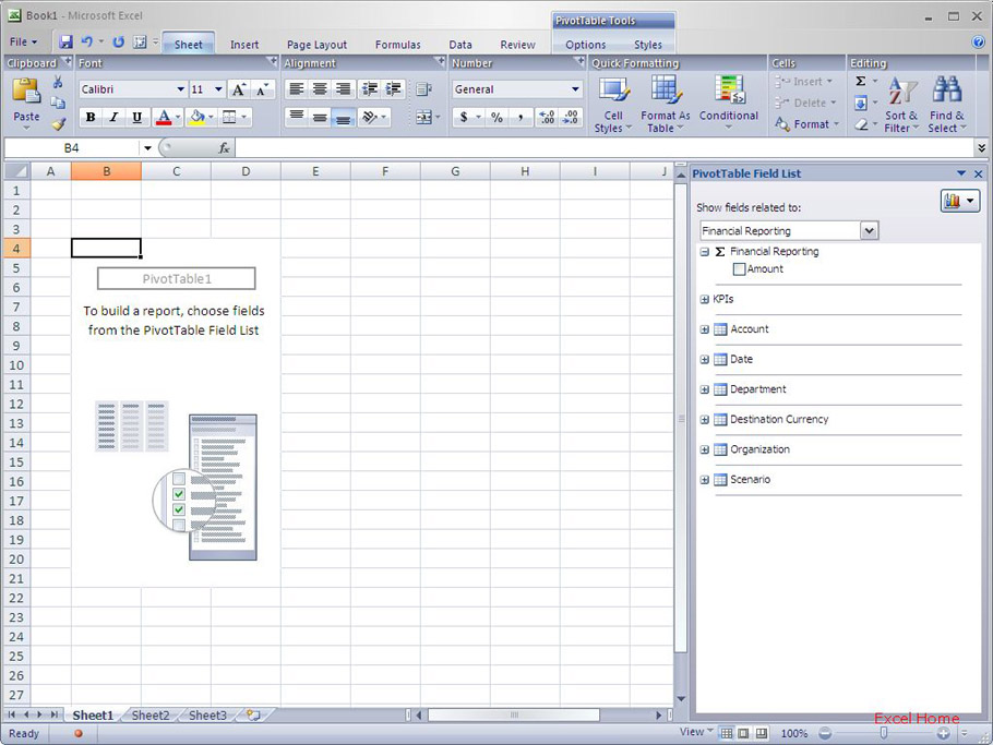
And here is the resultant field list, filtered to only show information related to Financial Reporting. Now there is only one measure group folder visible and significantly fewer dimensions, it is much simpler for me to find the fields I need.
这里是字段清单结果,筛选为只显示与财务报告相关的信息。现在,只有一个衡量组合文件夹是可见的,并且维度也明显少了,这样我就更容易找到我需要的字段了。
Perspectives in PivotTables
One feature available in SQL Server 2005 Analysis Services is the idea of a “perspective”. To crib from the Analysis Services website, a large Analysis Services model can present to the user a large number of dimensions, measure groups, measures, and KPIs and may be challenging to navigate, even with the ability to filter the field list based on a measure group discussed previously. A perspective, which is defined in the Analysis Services model, creates a subset “view” of a cube – essentially, model designers can create perspectives that only contain the information needed for a given purpose.
数据透视表的透视法
SQL Server 2005 Analysis Services中有个功能,就是“透视法”。从Analysis Services网页上直接抄过来,庞大的Analysis Services模型会在用户前面呈现庞大的维度,衡量组合,衡量和KPIs,这可能会使浏览更困难,即使使用前面讨论过的基于衡量组合筛选字段。透视法,在Analysis Services模型里定义,会创建一些“视图”子集——从本质上说,模型设计者可以创建只包含既定目标所需信息的透视法。
Excel 12 supports perspectives; once a user has connected to a perspective (which to Excel 12 looks just like any other data source), the PivotTable Field List will only show the measure groups included in the perspective inside the “Show fields related to:” drop down, and selecting (All) in the drop-down will only show the user the fields included in the perspective.
Excel 12支持透视法;用户一旦连接到透视法(对于Excel 12来说,这就象其它任意的数据源),数据透视表字段清单在“Show fields related to:”下拉框里只会显示透视法里包含的衡量组合,并且下拉清单里的选择只会显示透视法里包括的字段给用户。
Hierarchies make exploration easy
The last Analysis Services feature I will cover today are hierarchies. One of the advantages of PivotTables based on Analysis Services models is that you can set up hierarchies within each dimension. Hierarchies help users navigate the data intuitively and correctly. To users, a hierarchy defines relations between fields … let’s look at an example. In the screenshot below, I’ve expanded the Customer Geography hierarchy to show the individual fields (or levels) it contains.
层次让浏览容易
今天我最后要讲的Analysis Services特点是层次。基于Analysis Services的数据透视表的优点之一是你可以在每个维度内设置层次。层次帮助用户直观正确地浏览数据。层次为用户定义字段之间的关系……我们来看看一个例子吧。在下面的截屏中,我展开了Customer Geography层次,里面包含具体的字段(或者级别)。
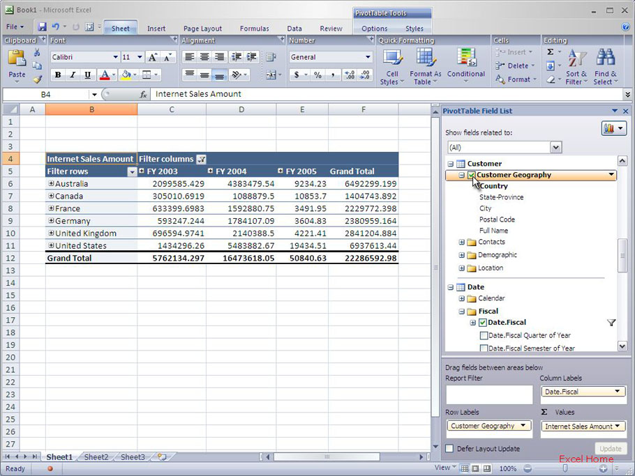
In this example there are five levels, so when I add Customer Geography to the PivotTable by clicking the checkbox for it, I’m actually adding five fields at once (for non-Analysis Services data sources, you have to add multiple fields in the right order to get the same report, and it might not always be obvious which fields to pick.). This gives me the opportunity to expand countries to see states etc. without having to also add the four other fields to the PivotTable. After I’ve added Customer Geography to the PivotTable, I can explore the hierarchy by clicking the expand indicator (“+”) for Australia in the PivotTable, which shows me the next level of detail (“State-Province”).
在本例中,有五个级别,因此当我通过点击勾选框添加Customer Geography到数据透视表时,我实际上在一次性添加五个字段(对于非Analysis Services的数据源,你得安装正确的顺序添加多个字段到同一个报告,并且需要选择哪个字段不会总是那么明显)。这让我有机会展开国家来查看州等,而不必要添加其它四个字段到数据透视表。在我添加Customer Geography到数据透视表后,我就可以通过点击展开标志(“+”)在浏览数据透视表里的Australia层次,它给我展示下一级的详细信息(“州-省”)。
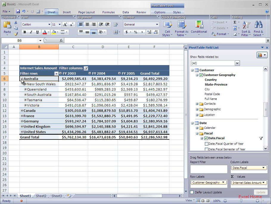
The new Excel 12 expand/collapse indicators (discussed in a previous post) appear automatically for hierarchies to make it very easy to determine when there are details to expand or collapse. For example, I could use the expand indicators to further expand to see “City”, “Postal Code”, etc.
新的Excel 12展开、折叠标志(在前面的文章中讨论)自动出现在层次前,非常容易知道是否要展开或者折叠详细信息。例如,我可以使用展开标志进一步展开并查看“City”,“Postal Code”,等等。
Published Thursday, December 29, 2005 3:12 PM by David Gainer
注:本文翻译自http://blogs.msdn.com/excel,原文作者为David Gainer(a Microsoft employee),Excel home授权转载。严禁任何人以任何形式转载,违者必究。