译者:hxhgxy 来源:http://blogs.msdn.com/excel
发表于:2006年7月7日
A Bit More On Charting
更多一些图表信息
Last week, in response to my post on charting, Harlan pointed at a few Economist charts as examples of professional charts. Today, I spent a few minutes with Excel 2007 trying to create a similar chart. I thought I would share the results.
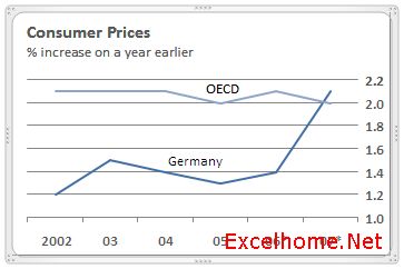
The chart in question is located here. It is a line chart with a title and some series labels. Here is a screen shot.
上周,在我关于图表的帖子之后,Harlan指出了一些专业图表的例子如经济学图表。今天,我在Excel 2007上花了几分钟,试图创建一个类似的图表。我想我应该分享该结果。
问题中的图表位于这里。这是一个折线图,带有标题和一些系列标签。这里有个截屏。
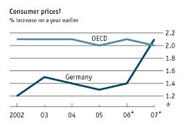
Source: The Economist web site
To start with in Excel, I typed in the data (source: The Economist web site) and inserted a line chart …
为了从Excel开始,我输入了数据(源:Economist网页)并插入折线图……
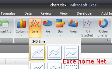
Here is what you will see in the beta build when you insert a line chart.
这是当你插入折线图时,你将在beta版里看到的情况。
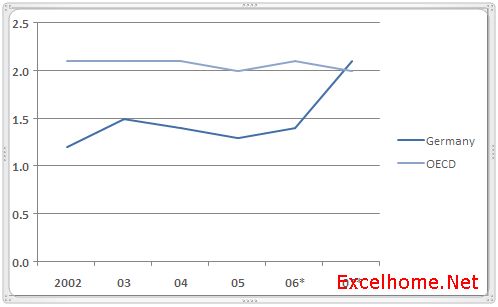
As you can see, the Excel chart looks similar in composition with respect to good charting technique – there are no graphic effects, and the data is emphasized, axes, tick marks, and gridlines have been subdued to allow the data in the plot area to stand out more. Next, I decided to fiddle around with a few settings to see how hard it would be to get things closer. A few clicks to add a title, change where the vertical axis is, and resize the chart a bit and I had something looking very close.
正如你看到的,Excel图表看上去和好的图表技术在组成部分方面是相似的——没有绘图效果,强调了数据,轴,标签和网格线被柔和了以使图表区的数据更突出。接着,我决定做一些设置,看看将事情弄得更相近一些会有多困难。点击几下,添加标题,改变竖直坐标轴的位置,并改变图表大小,我有了个看上去很接近的东西了。
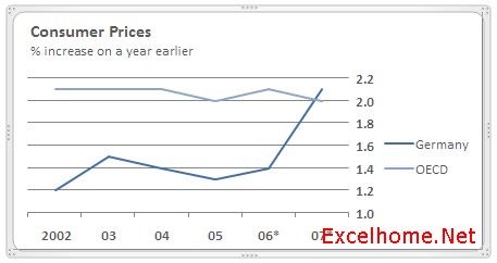
The one major difference is that the legend is outside the chart, and in the chart plot area next to each series. Again with a few more clicks, I removed the legend from the chart and added two text boxes (“OECD” and “Germany”) and positioned them near the appropriate data series. With a few more clicks, I have something very close.
一个主要的区别是图例在图表外头,而应该在图表绘图区每个系列的旁边。同样,再点击几下,我从图表中删除掉了图例并且添加在两个文本框(“OECD”和“Germany”)并将它们放在适当的数据系列旁。更多点击几次,我得到了非常接近的东西了。
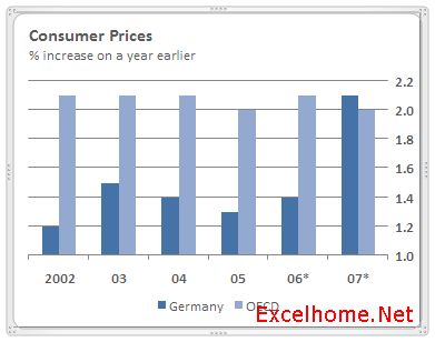
The point I am trying to get across here is that our default styles (and many of the other styles we include in Excel) are, I believe, what a lot of people are looking for with respect to “professional” and “effective”. (I know there are features that would make the above easier, and like I said in the previous post, we are planning to continue to work in that area going forward.) Here is what the same chart looks like when turned into a bar chart … again, the focus is on clarity of data.
我在这里想要表达的意思是,我相信,我们缺省的样式(以及我在Excel包含的许多其它样式)都是许多人们期望的“专业”和“有效的”图表。(我知道有些功能可以使上述工作更任意些,并且正如我在前面的帖子说的,我们计划继续这个领域的工作。)当转换为柱型图时,同一个图表就会象这样……同样,侧重点是突出数据。
So that’s it for today. Download the beta, try the styles, and let us know. As always, feedback welcome.
好啦,今天就到这儿。下载beta版,尝试各种样式,并且给我们反馈,反馈总是受欢迎的。
Published Monday, June 05, 2006 10:13 PM by David Gainer
Filed Under: Charting
注:本文翻译自http://blogs.msdn.com/excel ,原文作者为David Gainer(a Microsoft employee),Excel Home 授权转载。严禁任何人以任何形式转载,违者必究。