译者:snood 来源:http://blogs.msdn.com/excel
发表于:2006年7月7日
Quick detour – cool things on the status bar and great-looking charts
快速入门-非常酷的状态栏和精美图表
Today I decided to take a quick break from Excel Services to
talk about a few small but useful changes that have been made to the status bar and
show off a few charts
First, the status bar
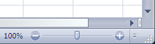
Zoom control – we have added a slider that allows the user to adjust the “zoom” of the document without needing to pop up any windows. When you slide the control, the document resizes as you slide, so you can adjust to just the “zoom” you want before you let go of the slider. You can also click on the + and – buttons to increment or decrement “zoom” by 10% per click. Finally, for those of you that like using the zoom dialog, you can just click on the 100% (which is a button) and it will launch the Zoom dialog.
我今天要谈Excel2007中质的突破:
1. 小巧变化的状态栏
2. 炫耀几个图表
首先是状态栏
缩放控制 – 增加了一个不需弹出窗口的控制滑块来调整文件的缩放比例,当你调整控制滑块时,文件同时改变显示比例。你也可以在按“+”和“-”按钮来放大或缩小显示比例,每点一次调节10%。 最后,对于喜欢使用显示比例对话框的人来说,也可以按100%(这是一个按钮) 来调出显示比例对话框.
Multiple status bar calculations – In previous versions of Excel, when you selected numerical data, you could see a summary of that data in the status bar – sum, count, average, etc. You could choose from 6 different summaries, but you could only see one at a time. That seemed unnecessarily limiting, so in Excel 12 we let you put any or all of them on the status bar, so you can see sum, min, max, numerical count, count, and average all at once if you like, or any combination of the six.
多样化的计算状态栏确 – 在之前的Excel版本中,当你选中了数值数据时,可以在状态栏看到这些数据的小计 –求和,计数,平均值等等,可以选择6种不同的小计方式,但一次只能看到一种。这是不必要的限制,所以在Excel 12中你可以把几个或者全部的小计方式显示在状态栏,求和、最大值、最小值、计数, 计数值,平均值的全部显示或者显示其任意组合。
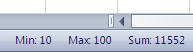
You specify the items you would like to see by right-clicking on the status bar.
如果要自定义显示项目只需在状态栏上点击右键,如下图。

View switcher – In the tradition of Microsoft Word and Microsoft PowerPoint, we have added a set of buttons to the status bar that allow you to switch between views. One is for normal view, one is for page break preview, and the third is for a great new view we have added to Excel 12 – page layout view. Much more on page layout view when I cover the formatting, printing, and layout improvements we have made in Excel 12 (probably early next year at current speed).
视图切换 – 在传统的Microsoft Word和Microsoft PowerPoint中,我们已经在状态栏上增加了一组按钮来切换视图。一个是普通视图, 一个是页面视图,第三个是一个全新的视图,我们已经加入Excel 12的页面版式视图。在Excel12的页面版式视图中,包含格式、打印和版式改进 (按照现在的进度可能在明年初)。

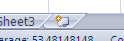
Insert worksheet button – ok, this isn’t on the status bar, but it is close, so I am including it in this post. You may have noticed in previous posts that there was an additional small button after the tabs in the spreadsheets I have been showing off. When clicked, this button adds a worksheet. The point is simply to make it quicker to add worksheets to your workbooks.
插入工作表按钮 – 好,这个不在状态栏,但却很接近,所以我把它也放在这个贴子中. 你也许看到过以前的贴子里展示过的这个新增加的工作表标签后的小按钮。只要单击这个按钮就会在工作簿中新增一个工作表,这一点比较快捷。
And now for some screenshots of charts …
接着看一些图表的屏幕截图
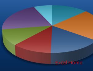
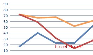
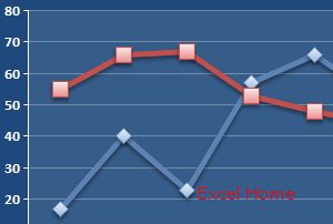
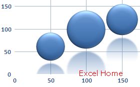
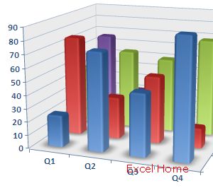
We have done a lot of great work in charting this release (see the overview post for a bit of a description). I am going to cover this work in detail sometime around the new year, but to give everyone an idea of what is coming, I thought I would post a few screenshots of charts I made yesterday afternoon. This should give everyone an idea as to the vastly improved charting that is coming with Office 12. The most obvious thing you will notice is the range of new graphic effects, like transparency, lighting effects, shadows, reflections, etc. Besides being much better looking with a greater range of graphic effects, we have also done a lot to make it a snap to create a very wide variety of different, professional-looking charts. Each of the charts below were created with no more than 2-3 clicks total, so the whole thing took a matter of minutes. Enjoy.
(Note, there is more than one chart on each screenshot, so I encourage you to click on the images below and take a look.)
在Office 2007版本中,我们在图表方面做了很多工作 (参看总述贴子里的一些说明). 在新的一年里我将详细介绍图表,为了让大家对新的图表有一个印象, 先贴一些我昨天下午做的图表的屏幕截图. 在Office 2007图表中,给人的第一个印象就是作了许多改进,最明显的是你可以察觉的一系列新平面效果,如透明度、灯光效果,阴影, 倒影等。除了更加好看,我们也做了很多工作,使之能创建精美的专业图表。每个图表的创建总共不超过2-3次点击,所以非常方便。 满意。
(注,在每个屏幕截图中不止一种图表,所以我希望你点击图片的链接仔细地看看).

Next week, back to Excel Web Services and more about running spreadsheets on the server.
下周回Excel网络服务器,并在服务器上多用用电子表格。
Published Friday, November 18, 2005 9:55 AM by David Gainer
注:本文翻译自http://blogs.msdn.com/excel ,原文作者为David Gainer(a Microsoft employee),Excel Home 授权转载。严禁任何人以任何形式转载,违者必究。